
(via)
Matadornetwork.com published 57 MAPS THAT WILL CHALLENGE WHAT YOU THOUGHT YOU KNEW ABOUT THE WORLD and the results are pretty interesting, shocking, and insightful. But really, the underlining truth is this: Canada is the best place to live and a well constructed map is crazy fun to look at. And educational.
And according to West Wing, maps have radically shaped the way we view the world - unfairly so.
Here are 9 of Matadornnetwork's 57 maps (1 from waitbutwhy) that can WoW us, challenge us, and reveal us:
1. There's an equal number of people in the blue and red areas
via waitbutwhy.com
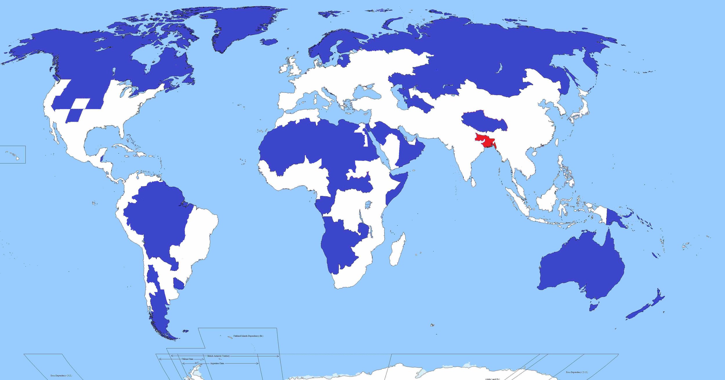
2. Countries that don't use the metric system

Those other countries are Liberia and Myanmar (Burma). (via)
3. World air travel routes
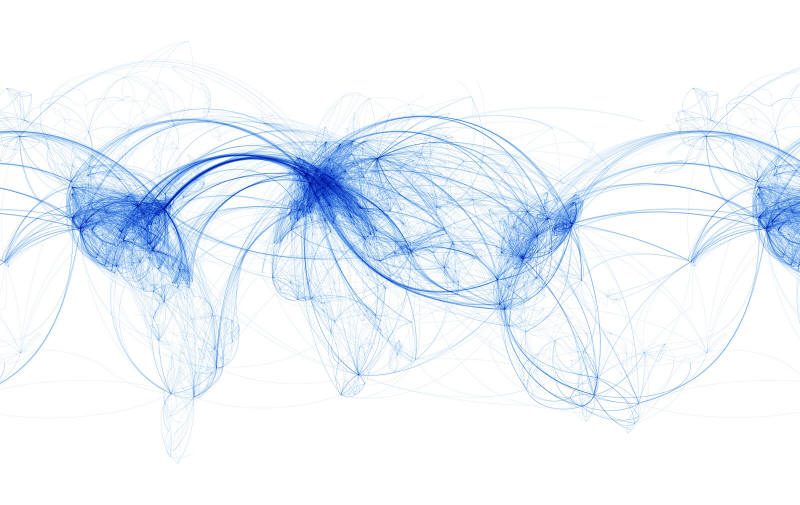
This map includes only the arcs made in air travel routes. (via)
4. Freedom of press map

From 2012, this map outlines the relative freedoms of press per country of the world.(via)
5. South-north world map

Breaking from the long-held convention of orienting north as “up” established by Ptolemy (90-168 AD), and resulting from the majority of cartography taking place in the Northern Hemisphere, this world map seems turned on its head (by orienting south as up). Fun fact: Evidently in the Middle Ages, cartographers routinely fixed east as up, “to orient.” (via)
6. Global internet usage based on time of day

With that orange upside-down “U” representing daylight hours, and a color spectrum spanning from red to blue (red indicating usage increase above average, blue indicating a usage decrease), this gif-map is visually stunning, but perhaps not terribly surprising. (via)
7. World map of countries England has not invaded

Of the 196 countries of the world today, there are only 22 of them that Britain has not invaded, though only 21 appear on this map (suspiciously absent is the island nation of Sao Tome and Principe). (via)
8. US auto-complete map

With the recent success of “crowdsourcing” for everything from ideas, to products, to scientific data, it would be difficult to deny there must be some horrifying truth to the information in this map. Populated by searching “State name is…” in Yahoo and allowing the “topmost satisfactory result” to represent each state, this map illustrates exactly what the internet seems to think about the states, and the US as a whole. (via)
9. US map of the highest-paid public employees by state
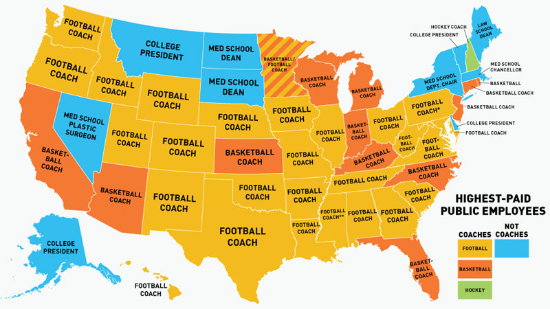
Clearly, America loves its football, to the tune of $5,545,852.00 (Head Coach Nick Saban of Alabama’s 2013 salary). (via)
10. US in seven deadly sins

While I don’t wholly agree with the criteria used to compose each sin-map, it was interesting to see the distribution of average income compared to the poverty line, total theft, number of violent crimes, entertainment expenditures, fast-food restaurants, number of STD cases, and an aggregate of the lot in a plain and clear representation. It would seem that Iowa is the most “saintly” by these standards. (via)
Click here for maps of our favorite fictional worlds, an infographic of how the world reads, or posts about random things you might find interesting.
Thanks for reading!