ARTSY EDITORIAL
BY ABIGAIL CAIN
FEB 13TH, 2017 10:23 PM
“Red,” writes historian Michel Pastoureau in Red: The History of a Color, “is the archetypal color, the first color humans mastered, fabricated, reproduced, and broke down into different shades.” As such, it dominated visual culture for centuries. With the advent of the Protestant Reformation, however, people began to view the shade as gaudy, even immoral, and its preeminence began to fade. Today, both blue and green surpass red as the West’s favorite colors.
But the bold hue—whether crimson, vermilion, cardinal, or scarlet—still retains power. Red artworks fetch the highest prices at auction. Red is the color of revolution, of seduction. And its story is far from over. The scientists who last year announced the discovery of a new blue pigment are now hunting for a never-before-seen red. From some of humanity’s earliest cave paintings to Mark Rothko’s immersive abstract canvases, here is a brief history of red in art.
Red Ochre

Cave paintings at Cueva de los Manos, Argentina. Photo: Wikimedia Commons

Cave paintings at Altamira, Spain. Photo: Wikimedia Commons
Red has been part of our palette since the very beginning of human history. Ochre—a naturally occurring pigment that is the source of earthy shades of brown, orange, and yellow—is red when it is composed of hematite. Neanderthals were using red ochre as far back as 250,000 years ago, in a region that has since become the Netherlands. Some scientists believe that these early cultures applied the color to their bodies as decoration; others think it may have been used in more practical ways, perhaps as an adhesive or a method of softening animal hides. Later, during the Upper Paleolithic period, early artists began employing the pigment as paint. The dusky red bison dotting the cave walls of Altamira in Spain are some of the oldest, dated between 20,000 and 14,000 BC.
Cinnabar

Mural at Pompeii, Italy. Photo: Wikimedia Commons

“Box with Camellias,” China, 13th Century. Image via The Metropolitan Museum of Art.
By the time pharaohs ruled Egypt, the number of reds used in artmaking had multiplied to include cinnabar, a natural mercuric sulfide that was also incredibly toxic. (The mercury mine in Almadén, Spain, where Rome later extracted its cinnabar, was basically a death sentence for workers.) Ancient Romans loved the brilliant red pigment, a preference reflected in its high prices during that time. Pliny the Younger wrote that cinnabar cost 15 times more than red ochre from Africa and was equal in price to the precious Egyptian blue. Gladiators who emerged victorious from the Colosseum might be smeared with the shiny red mineral and then paraded through the streets of Rome. Cinnabar is also prominently featured in the murals that grace the walls of upper-class villas in Pompeii.
Cinnabar later became synonymous with the carved lacquer produced in China beginning in the 12th century. These elaborately patterned luxury items, which could be anything from vases to incense holders, were typically colored with the powdery red pigment that gave them its name.
Minium

Albrecht Dürer, Virgin and child with St Anna, 1519.
Like cinnabar, minium (also called “red lead”) is a highly poisonous material. Scholars consider it one of the first synthetic pigments, with Romans heating white lead to extreme temperatures to produce the paint. Its eye-popping orange shade showed up well against marble and gold, and it was often used for inscriptions. Later, medieval illustrators would employ the pigment in their illuminated manuscripts. But it was most popular with Mughal artists from India and Persia in the 17th and 18th centuries—so much so that their paintings became known as “miniatures,” after the minium that accented their works.
Vincent van Gogh was an avid user of red lead, a decision that has frustrated conservators centuries later. As it turns out, minium “whitens” under light, and many of the Dutch painter’s most famous works have seen their red accents fade over time.
Vermilion

This is where names start to get tricky. Ancient authors used the word “vermilion” to describe the pigment made from grinding up cinnabar. But vermilion also refers to the synthetic version of the color, invented in China thousands of years before it was brought to the West by Arab alchemists during the Middle Ages. This vermillion was used extensively by Renaissance painters, including Titian, who is renowned for his luxuriant reds. Although the pigment is normally an orangey-red, when exposed to sunlight it can darken to black.
Vermilion became increasingly popular beginning in the 16th century, and the industry for the pigment boomed—first in Venice, and later in the Netherlands and Germany. It appeared on shelves everywhere from hardware stores to apothecaries to paint shops. In the end, although it was pricier and less stable than minium, vermilion won out in a battle of the reds.
Carmine


Cochineal bugs were the third most valuable export from the New World in the 16th century, right behind gold and silver. These white, pellet-shaped insects didn’t look like much when attached to the pads of Mexico’s prickly pear cacti, but when dried and crushed they produced a vivid red hue that would take Europe by storm. Although originally a dye, cochineal was soon transformed into a paint called “carmine,” which took up residence in 15th- and 16th-century painters’ palettes—Rembrandt, Anthony van Dyck, Rubens, and Vermeer among them.
It persisted into later centuries, with artists including J.M.W. Turner and Thomas Gainsborough incorporating the paint into their works. Although carmine produced a rich crimson glaze, often used on top of other reds like vermilion, it also had a tendency to fade in sunlight. The compositions of 18th-century portrait painter Joshua Reynolds fell victim to this phenomenon; his subjects look pale and ghostly today, more like marble sculptures than living beings.
Cadmium Red

It would be several centuries before the next major innovation in red pigment came along. In 1817, a German chemist uncovered a new element, cadmium, which became the foundation for new shades of yellow and orange paint. But it wasn’t until 1910 that cadmium red was available as a commercial product, offering an alternative to the traditional vermilion. Henri Matisse was the first major champion of the new pigment, trying in vain to get his friend Renoir to make the switch. Like most Impressionist painters, Renoir was loyal to his original palette. (Since the plein air technique favored by Impressionists privileged speed, it was helpful to know exactly how paints would mix together.) When Matisse loaned him a tube of cadmium red, the older painter responded, “It is very irksome to change,” and promptly returned the paint.
Lithol
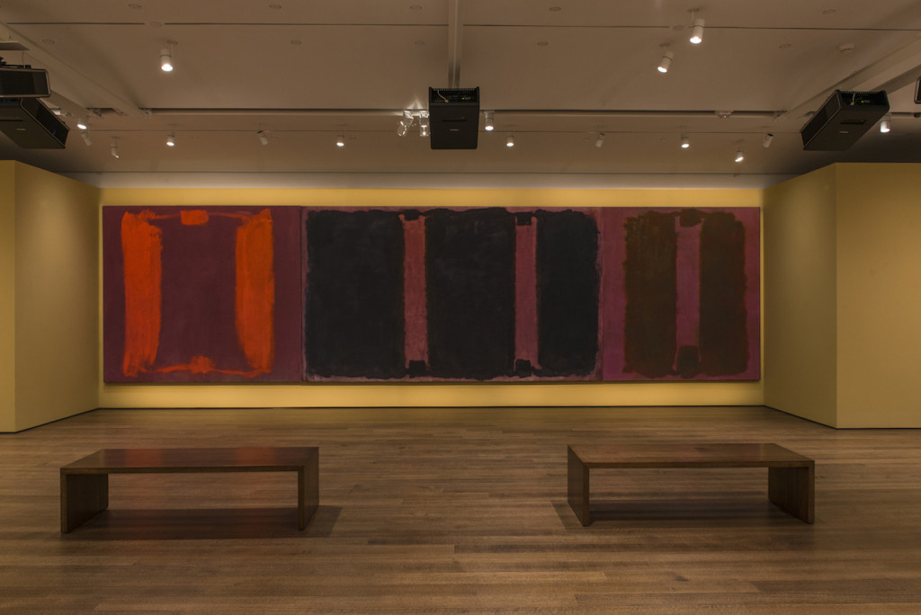
Mark Rothko’s Panel One, Panel Two, and Panel Three (Harvard Mural Triptych), with restored colors using light from digital projectors. © 2014 Kate Rothko Prizel and Christopher Rothko/Artists Rights Society (ARS), New York. Photo: Peter Vanderwarker, © President and Fellows of Harvard College.

In the late 1940s, Jackson Pollock started splattering commercial house paint across his canvases in huge, sweeping gestures. These iconic works offer a striking and high-profile example of artists’ increasing experimentation with materials throughout the mid-20th century. Rothko, too, dabbled with untested pigments in his work with various results. In 1962, he incorporated two brand-new organic reds into his palette for a series of murals at Harvard University. One of these pigments, Naphthol, had no ill effects. But Rothko’s other choice, Lithol, eventually doomed the works. Still in use today as a low-cost ink in the printing industry, Lithol red is highly sensitive to light. After several years hanging in the university’s penthouse dining room, Rothko’s deep reds and pinks had faded to light blue. By 1979, the paintings were so damaged that they had to be permanently removed.
—Abigail Cain